ellengard
Posts: 3253
Joined: 10/2/2006
Status: offline

|
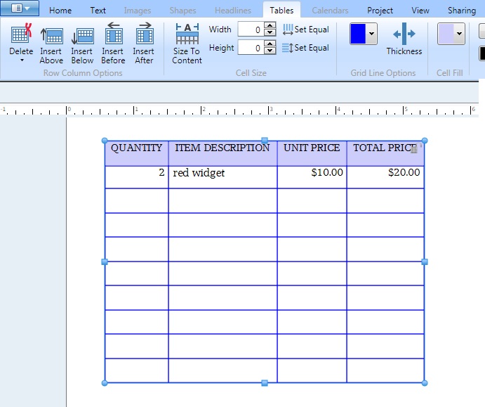
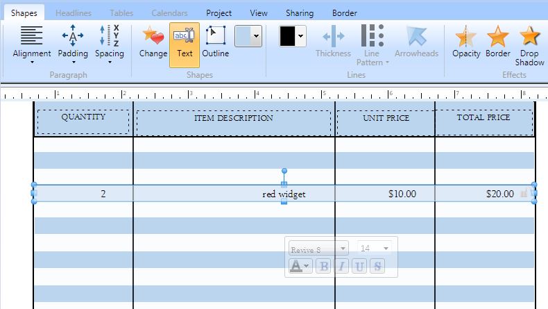
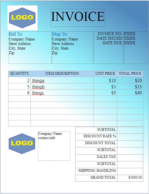
Forms should be designed with a TABLE, and then we can easily double-click in each cell to add text. Here is an example of a table. You can apply background colors to cells. You can apply right or left alignment to the cells. It's easy to add/remove columns and rows. It may take some time to set up your table with the formatting you want, but then you can reuse the table over and over again by editing the contents of the cells.
quote:
... and also how do I print it out
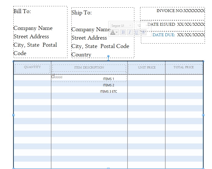
For many of these form templates, I found that it took a very long time for the print job to spool. Probably because there are so many individual items on the page e.g. all those colored rectangles, all those line segments, and all the individual text boxes. Each item is on its own layer. So you have a project with perhaps over 30 items and layers! 
So after you hit Print, go get yourself a coffee. When you come back, the print should start 
In contrast, my table prints very quickly because it is one item on one layer.
 Attachment (1) Attachment (1)
< Message edited by lindarobin -- 3/11/2017 4:25:48 AM >
|

 Printable Version






 New Messages
 No New Messages
 Hot Topic w/ New Messages
 Hot Topic w/o New Messages
 Locked w/ New Messages
 Locked w/o New Messages
 Post New Thread